


คลังข้อสอบ IELTS Writing Task1 (Academic) มากกว่า 10 ชุด!! ฝึกครบได้ Band7++ แน่นอน
- Eng for Edu

- Mar 18, 2022
- 11 min read
Updated: May 12, 2023

คอร์สเรียนวีดีโอราคาประหยัด โดยศิษย์เก่าวิทยาลัยนานาชาติมหิดล ตัวจริงเรื่องภาษาอังกฤษ เก่งขึ้นอย่างเร่งรัด เห็นผล มีเทคนิคเด็ด พร้อมเก็งข้อสอบให้พร้อม ประหยัดเวลาฝึกเอง
You should spend about 20 minutes on this task.
The chart and graph below give information about sales and share prices for Coca-Cola.
Summarise the information by selecting and reporting the main features, and make comparisons where relevant.
Write at least 150 words.

Model answer
The pie chart shows the worldwide distribution of sales of Coca-Cola in the year 2000 and the graph shows the change in share prices between 1996 and 2001.
In the year 2000, Coca-Cola sold a total of 17.1 billion cases of their fizzy drink product worldwide. The largest consumer was North America, where 30.4 per cent of the total volume was purchased. The second largest consumer was Latin America. Europe and Asia purchased 20.5 and 16.4 per cent of the total volume respectively, while Africa and the Middle East remained fairly small consumers at 7 per cent of the total volume of sales.
Since 1996, share prices for Coca-Cola have fluctuated. In that year, shares were valued at approximately $35. Between 1996 and 1997, however, prices rose significantly to $70 per share. They dipped a little in mid-1997 and then peaked at $80 per share in mid-98. From then until 2000 their value fell consistently but there was a slight rise in mid-2000.
(163 words)
You should spend about 20 minutes on this task.
The chart below gives information about global sales of games software, CDs and DVD or video.
Summarise the information by selecting and reporting the main features, and make comparisons where relevant.

Write at least 150 words.
Model answer
The chart shows the changes in the sales of video material / DVDs, games software and CDs around the world in billions of dollars over a three-year period. It can be seen that the sales of videos / DVDs and games software have increased, while the sales of CDs have gone down slightly.
Between 2000 and 2003, the sale of videos and DVDs rose by approximately 13 billion dollars. In 2000, just under 20 billion dollars worth of these items were sold, but in 2003, this figure had risen to a little over 30 billion dollars.
The sales of games software also rose during this period, but less sharply. Sales increased from about 13 billion dollars in 2000 to just under 20 billion dollars three years later. By contrast, during the same time period, the sale of CDs fell from 35 billion dollars in 2000 to about 32.5 billion dollars in 2003.
(152 words)
The graphs below show the types of music albums purchased by people in Britain.
Write a report for a university lecturer describing the information shown below.
You should write at least 150 words.
You should spend about 20 minutes on this task.


model answer:
The three graphs provide an overview of the types of music people purchase in the UK. At first glance we see that classical music is far less popular than pop or rock music. While slightly more women than men buy pop music, the rock market is dominated by men with 30% buying rock, compared to 17% of women. From the first graph we see that interest in pop music is steady from age 16 to 44 with 20% of the population continuing to buy pop CDs after the age of 45. The interest in rock music reaches its peak among the 25 to 34 year olds, though it never sells as well as pop. Interest also drops off after the age of 35 with an even sharper fall from age 45 onwards, a pattern which is the opposite to the classical music graph.
The chart below shows the amount of leisure time enjoyed by men and women of different employment status.
Write a report for a university lecturer describing the information shown below.
You should write at least 150 words.
Allow yourself 20 minutes for this task.
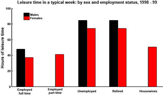
model answer:
The chart shows the number of hours of leisure enjoyed by men and women in a typical week in 1998-9, according to gender and employment status.
Among those employed full-time, men on average had fifty hours of leisure, whereas women had approximately thirty-seven hours. There were no figures given for male part-time workers, but female part-timers had forty hours of leisure time, only slightly more than women in full-time employment, perhaps reflecting their work in the home.
In the unemployed and retired categories, leisure time showed an increase for both sexes, as might have been expected. Here too, men enjoyed more leisure time over eighty hours, compared with seventy hours for women, perhaps once again reflecting the fact that women spend more time working in the home than men.
Lastly, housewives enjoyed approximately fifty-four hours of leisure, on average. There were no figures given for househusbands! Overall, the chart demonstrates that in the categories for which statistics on male leisure time were available, men enjoyed at least ten hours of extra leisure time.
โปรลับ!! หากแจ้งว่ามาจากเวปไซต์ จะได้รับส่วนลดพิเศษเพิ่มอีก จ่ายเพียง 4,999 บาทเท่านั้น!!
คอร์สเรียนวีดีโอราคาประหยัด โดยศิษย์เก่าวิทยาลัยนานาชาติมหิดล ตัวจริงเรื่องภาษาอังกฤษ เก่งขึ้นอย่างเร่งรัด เห็นผล มีเทคนิคเด็ด พร้อมเก็งข้อสอบให้พร้อม ประหยัดเวลาฝึกเอง
You should spend about 20 minutes on this task.
The charts below show US spending patterns between 1966 and 1996.

Write a report for a university lecturer describing the information below.
Write at least 150 words.

Model answer
The pie charts show changes in American spending patterns between 1966 and 1996. Food and cars made up the two biggest items of expenditure in both years. Together they comprised over half of household spending. Food accounted for 44% of spending in 1966, but this dropped by two thirds to 14% in 1996. However, the outlay on cars doubled, rising from 23% in 1966 to 45% in 1996. Other areas changed significantly. Spending on eating out doubled, climbing from 7% to 14%. The proportion of salary spent on computers increased dramatically, up from 1% in 1996 to 10% in 1996. However, as computer expenditure rose, the percentage of outlay on books plunged from 6% to 1%. Some areas remained relatively unchanged. Americans spent approximately the same amount of salary on petrol and furniture in both years. In conclusion, increased amounts spent on cars, computers, and eating out were made up for by drops in expenditure on food and books.
You should spend about 20 minutes on this task.
The maps below show the town of Langley in 1910 and 1950.
Summarise the information by selecting and reporting the main features, and make comparisons where relevant.

Write at least 150 words.

Model answer
The two maps show the town of Langley in the years 1910 and 1950 and the urban developments that took place. Overall, there were a number of notable changes to the buildings and amenities of this area. In 1910, the area had a combination of residential and industrial features, but by 1950 the industrial features had largely disappeared. Whereas in 1910 a railway line ran through the neighbourhood, by 1950 this had been removed. Furthermore, the townhouses which used to dominate the 1910 map had been replaced by blocks of flats by 1950, and the areas of wasteland had gone. Another major change to the area in 1950 was the development of more commercial and recreational features. The demolition of a second row of houses on Sherman Street and the removal of the railway line made room for a spacious park and children's play area. On the commercial side, to the right of the park some new stores were built on the aptly named New Lane, replacing the small store of 1910, and the cafe and laundry were relocated. To sum up, the area was renovated extensively, seeing fundamental changes to its residential accommodation, and its commercial and recreational facilities were developed.
You should spend about 20 minutes on this task.
The table below gives information about UK independent films.
Summarise the information by selecting and reporting the main features, and make comparisons where relevant.

Write at least 150 words.

Model answer
The table provides information about different types of independent films released in the UK and the Republic of Ireland in 2012. It indicates how many films of different genres were made and also shows what proportion of total ticket sales was made by each kind of film.
The table makes it very clear that there is no correlation between the number of films made in any category and the proportion of ticket sales earned by that sort of film. For example, the largest numbers of films were made in the Drama and Documentary categories - 35 of each of these were released. However, they earned only 8.3 and 2.9 percent of total ticket sales respectively.
Comedy films were the most financially successful: 26 films, out of a total of 148, earned 45.4 percent of all the income from ticket sales. Another very successful type of film in 2012 was the biopic. Although only one of these was released, it accounted for 9.1 percent of ticket sales.
(166 words)
You should spend about 20 minutes on this task.
The diagram below shows the production of electricity using a system called Ocean Thermal Energy Conversion (OTEC).
Write a report for a university lecturer describing the information below.

Write at least 150 words.
How Ocean Thermal Energy Conversion (OTEC) works Source: Daily Telegraph - 8th Jan 2008
Model answer
Ocean thermal energy conversion (OTEC) is a system that converts heat energy into the electric power using the temperature difference between surface seawater, which can be up to 29 degrees Celsius, and deep seawater, which is only 5 degrees Celsius.
The main components of the system are an evacuated evaporation chamber, a turbine and a condensing chamber. The solar energy of the sun heats up the surface water and this warm water is introduced into the evacuated evaporation chamber, where it boils. As it boils, salt is deposited and water vapour is generated. This vapour then drives a turbine to generate electricity. After it powers the turbine, the water vapour enters the condensing chamber, which is cooled by the water from the depths of the ocean. The water vapour is condensed in this chamber, producing drinking water. Meanwhile, waste salt water is discharged into the ocean and the process can be repeated.
(152 words)
You should spend about 20 minutes on this task.
The map below is of the town of Canterbury. A new school (S) is planned for the area. The map shows two possible sites for the school.
Summarise the information by selecting and reporting the main features, and make comparisons where relevant.

Write at least 150 words.
Model answer
The map shows two proposed sites for a new school for the town of Canterbury and the surrounding area.
The first site (S1) is situated in the countryside, to the north-east of the town centre. It is just outside the main housing area of the town and not far from the main road that links Sturry with Canterbury. It would therefore probably be in an ideal location for students coming from Sturry, which is only 5 kilometres away, and those who live on the east side of Canterbury. If there are students coming from Chartham, which is 7 kilometres to the south-west, they would be able to reach the school by taking the main road that runs south-west of Canterbury.
The second site (S2) is located in the town centre itself. There are advantages of this: it makes it practically equidistant for students coming from either Sturry or Chartham. Moreover, it would presumably be relatively easy for students who live in the housing area around the town centre to reach the school. However, because of the no traffic zone in the town centre, no parent would be able to drive their child all the way to school. This may make travel arrangements difficult for some parents.
(206 words)
The diagram below shows the production of steam using a gas cooled nuclear reactor.
Summarise the information by selecting and reporting the main features, and make comparisons where relevant.

Write at least 150 words.

Model answer
A gas-cooled nuclear reactor consists of the reactor itself and a heat exchanger. The reactor contains uranium fuel elements which are surrounded by graphite moderators and topped by charge tubes for loading fuel elements, and boron control rods. The whole reactor is contained in a pressure vessel surrounded by a concrete shield.
From the reactor the hot gas flows through a duct into the heat exchanger which is outside the concrete radiation shielding. In the heat exchanger, steam is generated in a secondary loop. There a pipe brings in water which is heated to steam, and this then flows out to the turbo-alternator. Meanwhile the hot gas sinks to the bottom of the heat exchanger and passes through a gas blower which pushes it into a cool gas duct and back to the reactor.
As can be seen, this is a continuous cycle that keeps the reactor from overheating, while carrying away the heat and steam, which will power the turbines.
(161 words)
You should spend about 20 minutes on this task.
The flowchart illustrates the production of coloured plastic paper clips in a small factory.
Write a report for a university tutor describing the production process.

Write at least 150 words.

Model answer
There are four main stages in the production of plastic paper clips from this small factory. Two of these stages involve actual preparation of the clips, while the other two consist of quality control before the clips are sent out from the factory to the retailers to be sold to the public.
To begin with, molten plastic is poured into three different moulds depending on the colour required; the colours are red, blue and yellow. Once these clips emerge from the moulds a quality control machine checks them for strength. Unsatisfactory clips are rejected. In the third stage in the process the clips are stored by hand into two groups, mixed and single colours. When this stage is complete the groups are checked a second time to ensure that the colour mixtures are divided correctly into single colours and mixed colour batches. Finally, the clips are packed and dispatched to the markets.
(152 words)
You should spend about 20 minutes on this task.
The diagram below shows how a central heating system in a house works.
Summarise the information by selecting and reporting the main features, and make comparisons where relevant.

Write at least 150 words.
Model answer
This diagram provides an overview of a domestic central heating system. It shows how the tank, boiler and pipes ensure a constant flow of hot waterto both the radiators and the taps.
The cold water enters the house and is stored in a water storage tank in the roof. From there ü flows down to the boiler, located on the ground floor of the house.
The boiler, which is fuelled by gas or oil, heats up the water as it passes through it. The hot water is then pumped round the house through a system of pipes and flows into the radiators, located in different rooms. The water circulates through the radiators, which have small tubes inside them to help distribute the heat, and this warms each of the rooms. Some of the water is directed to the taps to provide hot water for the house.
Once the water has been through the pipes and radiators, it is returned to the boiler to be re-heated and circulated round the house again.
You should spend about 20 minutes on this task.

The diagram below gives the information about the Hawaiian island chain in the centre of the Pacific Ocean.

Write a report for a university lecturer describing the information shown.
You should write at least 150 words.

model answer:
The Hawaiian island chain, in the centre of the Pacific Ocean, is approximately 2,700 km in length. It is formed of volcanoes and the active ones are at the south-east tip of the archipelago, where Hawaii itself is located. It is believed that the chain began to form nearly 80 million years ago. Each island started to evolve after an eruption on the sea floor. First, a `hot spot' existed on the ocean bed, which let out a plume of material called magma. This magma may originate as deep as 2,883km below the ocean bed. Next, further eruptions took place, which built up the volcano. Eventually, it emerged above the surface of the ocean. Since that time, the spume of magma has remained static as the Pacific tectonic plate moves in a north-west direction across it at a speed of 7-9cm per year. As it moves, a volcano forms as it passes over the hotspot and then become inactive when it has passed it.
(164 words)
Write a report describing the information in the graph below.
You should write at least 150 words.
You should spend about 20 minutes on this task.
model answer:
The chart shows striking changes in the fertility rate of women in six Gulf countries – Saudi Arabia, the UAE, Oman, Qatar, Kuwait and Bahrain between 1990 and 2000. In the ten year period, there was a decline in the number of births per woman in all countries. The biggest declines were in two countries which had low fertility rates at the start of the decade, Bahrain and the UAE. Fertility rates vary greatly between the six countries. Oman and Saudi Arabia had the highest rates, with over seven births per woman in 1990. This compared with around 4 births per woman in Bahrain and the UAE, and just 3.75 in Kuwait By 2000, the rate had fallen below three births per woman in Kuwait, Bahrain and the UAE, with a drop of over 25% in a decade in the UAE. However, in Saudi Arabia and Oman, the rates fell by just 20%, from 7.0 to 5.5. In summary, there were major decreases in birth rates in all countries, but some countries in the region have double the fertility rate of others.
โปรลับ!! หากแจ้งว่ามาจากเวปไซต์ จะได้รับส่วนลดพิเศษเพิ่มอีก จ่ายเพียง 4,999 บาทเท่านั้น!!
คอร์สเรียนวีดีโอราคาประหยัด โดยศิษย์เก่าวิทยาลัยนานาชาติมหิดล ตัวจริงเรื่องภาษาอังกฤษ เก่งขึ้นอย่างเร่งรัด เห็นผล มีเทคนิคเด็ด พร้อมเก็งข้อสอบให้พร้อม ประหยัดเวลาฝึกเอง


Comments